Brand refresh for independent coffee house
Client: Three Fat Ducks
Industry: Speciality Eatery & Coffee Shop
Project Scope:
- Branding
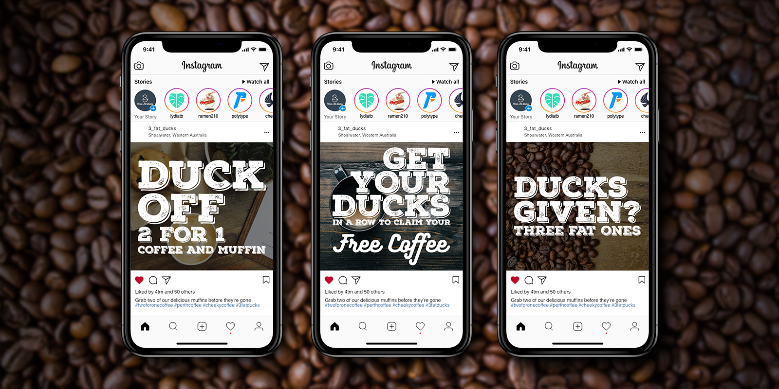
- Social Media
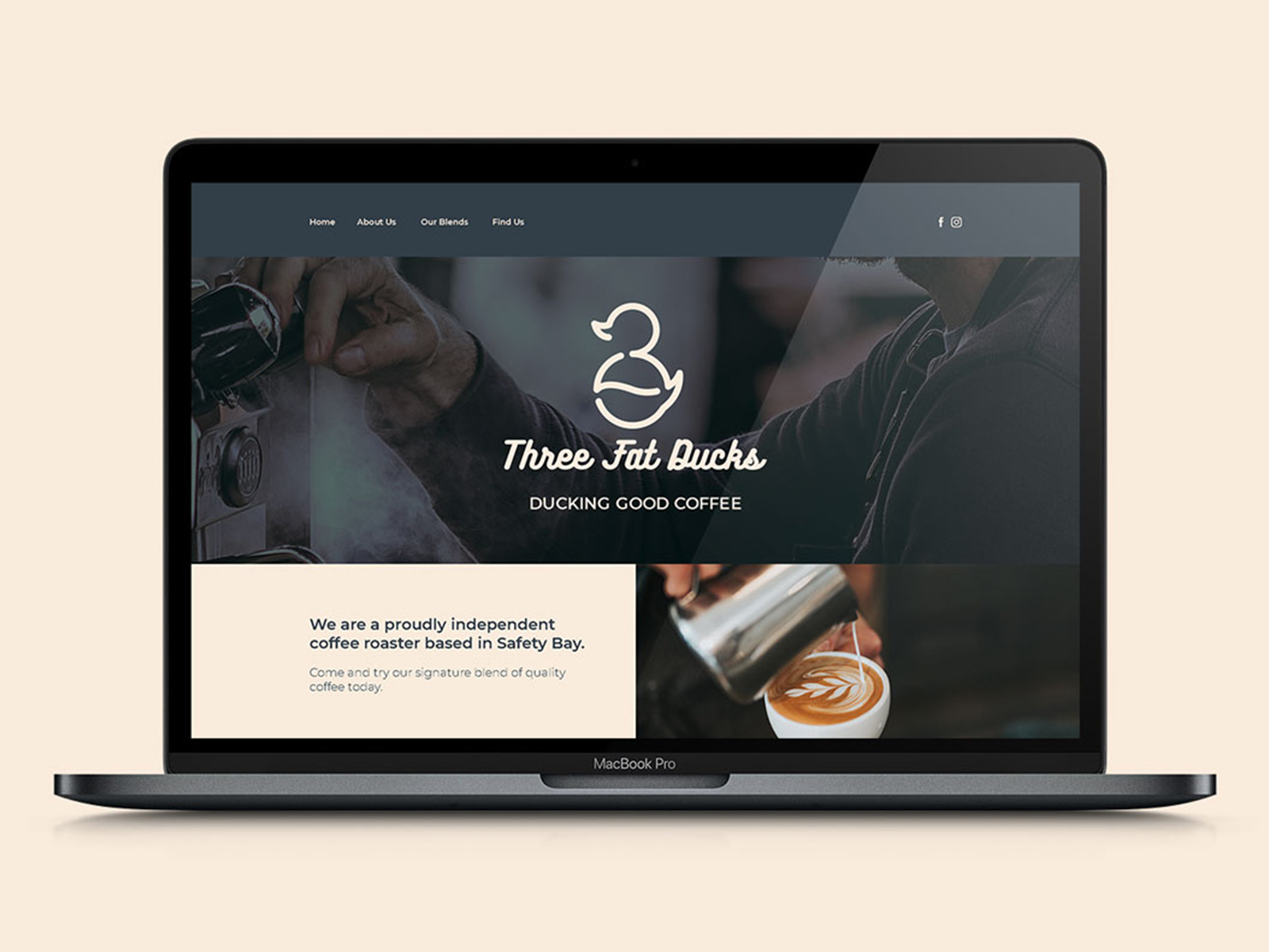
- Website
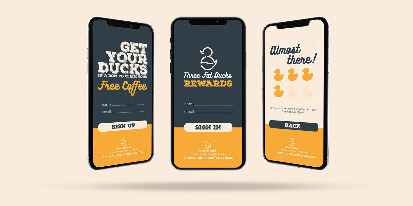
- App UX/UI
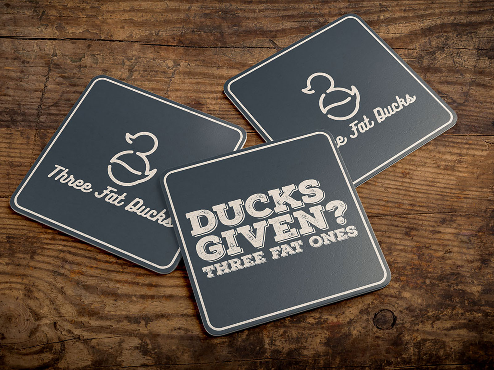
Under new management and bursting with attitude, the team at Three Fat Ducks set out to create a vibrant atmosphere that would resonate with their young family clientele. A key focus of the new brand was to introduce a touch of laid-back humor, seamlessly integrated across both in-house point-of-sale materials and social media platforms.
A collection of playful slogans were developed for promotions, such as 2-for-1 deals, with future plans to incorporate them into an app-based rewards program.
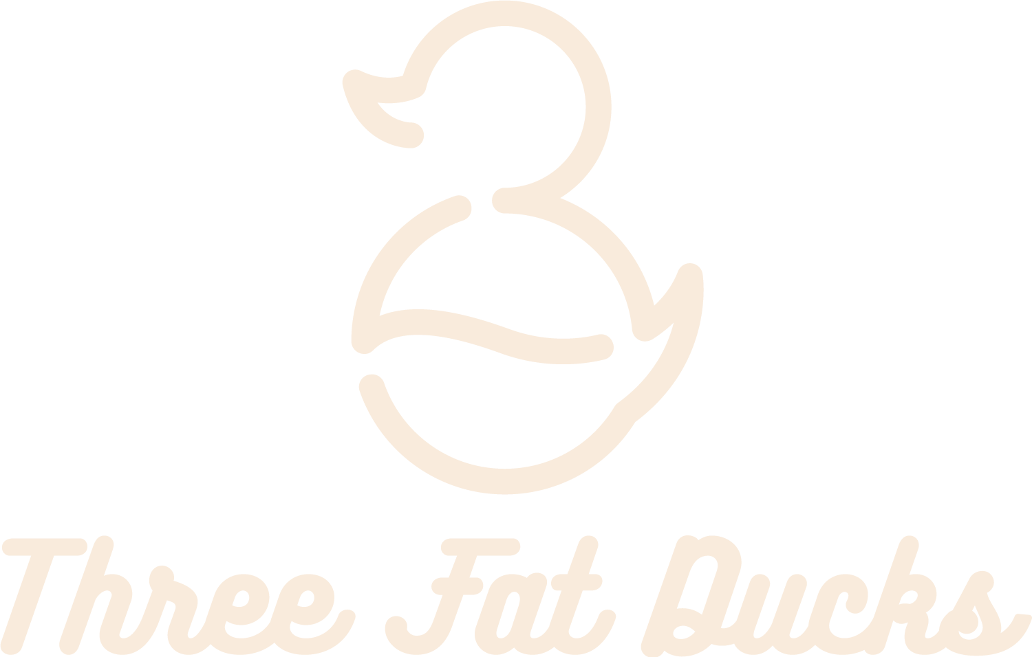
The logo blends three core elements: a coffee bean, the number three, and naturally, a fat duck. The logo’s aesthetic is complemented by a rounded script font, paired with a bold heading typeface to ensure maximum impact across social media.
